.svg)
.svg)
.svg)
%20(1).svg)
.svg)
.svg)
.svg)
.svg)
.svg)

.svg)
.svg)
.svg)


-

24/7 Customer Support
Get help by calling, chatting with, or emailing our customer support team. -

Onboarding Services
Get up and running quickly with a personalized onboarding plan. -

Free Courses & Certifications
Grow your skills with free HubSpot Academy courses and certifications. -

Developer Tools
Build apps, develop custom integrations, and customize your site. -

HubSpot for Startups
Apply for special pricing, resources, and support for your startup.
-

Ebooks, Guides & Templates
Check out our vast library of free resources, tools, templates, and more.
HUBSPOT CUSTOMER PLATFORM
Grow better with HubSpot
Software that's powerful, not overpowering. Seamlessly connect your data, teams, and customers on one AI-powered customer platform that grows with your business.
Get a demo of our premium software, or get started with free tools.
205,000+ customers in over 135 countries grow their businesses with HubSpot

What is HubSpot?
HubSpot is an AI-powered customer platform with all the software, integrations, and resources you need to connect your marketing, sales, and customer service. HubSpot's connected platform enables you to grow your business faster by focusing on what matters most: your customers.
Get a demo to learn about our premium software, or get started with our full suite of free tools and upgrade as you grow.
.webp?width=1814&height=936&name=crm-platform-asset-alt@2x%20(1).webp)
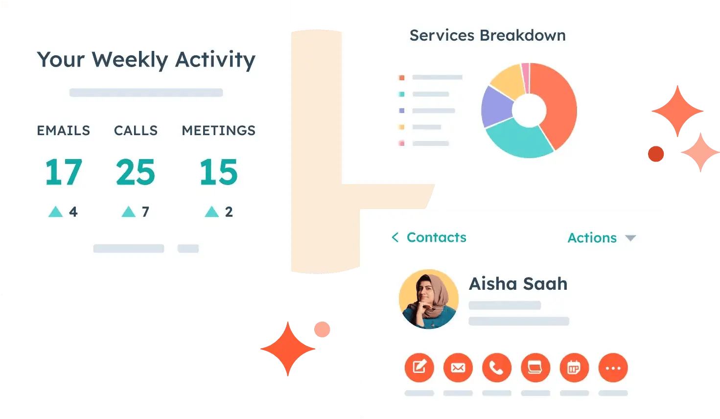
Your whole front office. One customer platform.
HubSpot brings your marketing, sales, and service teams together on the same AI-powered customer platform. It's easy to use, provides value fast, and gives all teams a unified view of the customer at every stage in their journey. Each product in the platform is powerful on its own, but the real magic happens when you use them together.
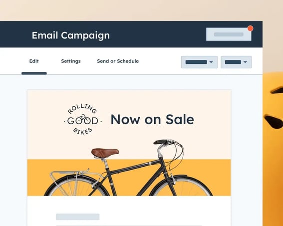
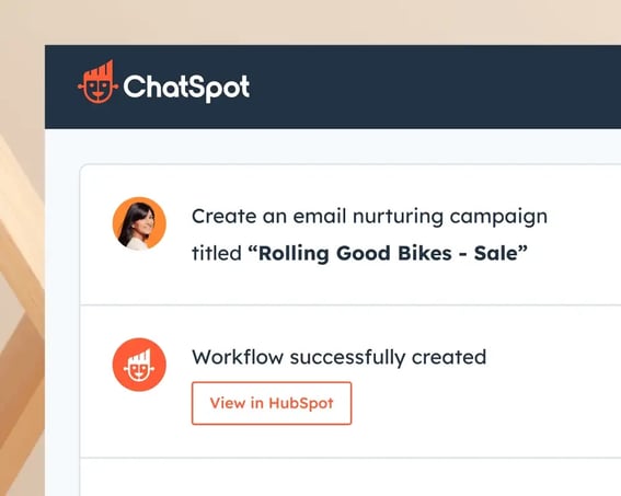
Marketing Hub®
AI-powered marketing software that helps you generate leads and automate marketing.
Popular Features
- AI-powered lead generation
- Marketing automation
- Analytics
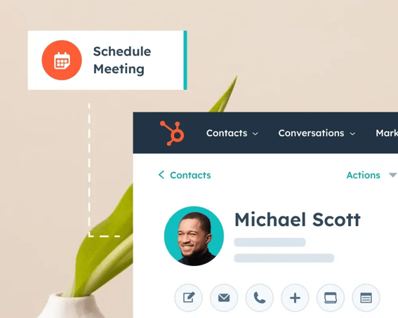
Sales Hub®
Easy-to-adopt sales software that leverages AI to build pipelines and close deals.
Popular Features
- Prospecting workspace
- Deal management
- Sales automation
Service Hub®
Customer service software powered by AI to scale support and drive retention.
Popular Features
- Omni-channel help desk
- AI chatbot
- Customer success workspace
New

Content Hub™
All-in-one, AI-powered content marketing software that helps marketers create and manage content.
Popular Features
- Content remix
- Brand voice
- AI-powered content creation
Operations Hub®
Operations software that leverages AI to help you activate and manage your data.
Popular Features
- Data sync
- Programmable automation
- AI-powered data quality automation
Commerce Hub™
B2B commerce software designed to help you collect payments and automate billing.
Popular Features
- Invoices & subscriptions
- Quotes
- Payment links
Drive revenue with high-quality leads
Find out how companies like yours seamlessly attract qualified leads, convert them into customers, and drive revenue.
Create campaigns efficiently with automation and AI
Manage campaigns and nurture leads with marketing automation that helps your teams work more efficiently as you grow.
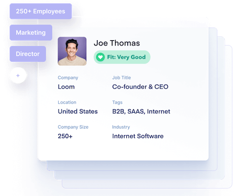
Find and engage sales prospects
Find out how sales teams like yours are forming stronger connections, booking more appointments, and building pipelines in less time and with much less pain.
What’s new at HubSpot
HubSpot welcomes Clearbit
There’s a new member of the HubSpot family — say hello to Clearbit.
Identify your target market, gauge intent of your website visitors, and easily enrich contact and company data directly within HubSpot.
1,500+ ways to connect your tools
View all apps

Voted #1 in 318 Categories
Learn morePopular blog posts
Explore the HubSpot blog Read more blog articlesGrow better with HubSpot today